Supporting social presence through a wearable system for contextual conversation awareness

Timeline
Oct 2025 - Dec 2025
Role
Product Designer
(Research + UX/UI Design)
Team
3 Product Designer
(Research + UX Design)
Skills/Tools
User Research (Interviews, Participatory Design, Testing), Figma
Context
Spatial awareness is central to social conversation, and not always accessible for all.
Social conversations demand constant spatial awareness, but for people with single-sided deafness, locating sound and tracking shifts in dialogue requires ongoing effort. In dynamic group settings, this invisible work can interrupt presence and make participation feel exhausting. This project explores how an assistive wearable system can support conversation awareness in everyday settings, without adding friction or drawing attention to the technology itself.
Design Question
How might we design an assistive interaction system that intuitively supports conversation awareness while preserving natural social interaction?
TLDR + Impact
Beam demonstrated that subtle, assistive cues can support conversation awareness without disrupting social interaction.
Beam is an assistive interaction system that helps people with single-sided deafness stay oriented in conversation using subtle, directional cues across everyday devices.
100%
haptic recognition accuracy
The participant correctly identified all three haptic patterns without prior cueing, validating haptics as a reliable primary signal that does not require visual attention during conversation.
12
interaction states evaluated
Evaluation across three urgency levels for conversational priority and four directions directly informed multiple core interface and interaction model decisions with lived experience.
3
design decisions revised
User feedback drove meaningful revisions to the interface and interaction model, reframing success around directional awareness and user control rather than initial assumptions.
Supporting social presence through a wearable system for contextual conversation awareness
Timeline
Oct 2025 - Dec 2025
Role
Product Designer
(Research + UX/UI Design)
Team
3 Product Designer
(Research + UX Design)
Skills/Tools
User Research (Interviews, Participatory Design, Testing), Figma
Context
Spatial awareness is central to social conversation, and not always accessible for all.
Social conversations demand constant spatial awareness, but for people with single-sided deafness, locating sound and tracking shifts in dialogue requires ongoing effort. In dynamic group settings, this invisible work can interrupt presence and make participation feel exhausting. This project explores how an assistive wearable system can support conversation awareness in everyday settings, without adding friction or drawing attention to the technology itself.
Design Question
How might we design an assistive interaction system that intuitively supports conversation awareness while preserving natural social interaction?
TLDR + Impact
Beam demonstrated that subtle, assistive cues can support conversation awareness without disrupting social interaction.
Beam is an assistive interaction system that helps people with single-sided deafness stay oriented in conversation using subtle, directional cues across everyday devices.
100%
haptic recognition accuracy
The participant correctly identified all three haptic patterns without prior cueing, validating haptics as a reliable primary signal that does not require visual attention during conversation.
12
interaction states evaluated
Evaluation across three urgency levels for conversational priority and four directions directly informed multiple core interface and interaction model decisions with lived experience.
3
design decisions revised
User feedback drove meaningful revisions to the interface and interaction model, reframing success around directional awareness and user control rather than initial assumptions.
Who We Designed With
Lived experience with single-sided deafness informed every design decision.
We worked closely with a participant with single-sided deafness over a two-month period through interviews, collaborative activities, and iterative discussions. She can hear only from her left ear, which makes it difficult to tell where sounds are coming from and to follow conversations when multiple people are speaking. These challenges are especially pronounced in noisy or group settings, where staying engaged requires extra effort.
Key Challenges
It’s not just hearing, it’s staying oriented in conversation.
Single-sided deafness doesn’t only affect volume; it disrupts spatial awareness, timing, and social confidence in everyday interactions.
Lost in noisy environments
Background noise makes it difficult to isolate voices and follow conversational flow, especially in group settings like restaurants or community events.
Missing moments of attention
When someone tries to get her attention from the side she cannot hear, those attempts often go unnoticed, leading to anxiety about seeming rude or disengaged.
Cognitive effort replaces presence
Constantly scanning for sound and adjusting position requires sustained mental effort, making social interaction feel exhausting rather than natural.
Social strategies aren’t enough. Positioning herself carefully or informing others about her deafness helps, but these workarounds are easy to forget and don’t scale across contexts.
Rethinking The Problem Space
Questions We Started Asking Ourselves
We initially understood the challenge as a hearing issue…
but lived experience revealed it was about navigating social moments.
We treated conversation as a fixed exchange…
but everyday social navigation required constant adjustment.
Social environments are unpredictable…
so cues had to remain intuitive, low-effort, and unobtrusive.
We focused on designing something that could realistically work with devices she already owns, remain intuitive and low-effort during conversation, and hold up in noisy, unpredictable social settings. This helped us prioritize a single, high-impact challenge, supporting directional awareness, without adding unnecessary cognitive load.
PROBLEM SPACE
A real gap, inside an ecosystem
that's already ready.
Single-sided deafness affects an estimated 60,000 new cases annually in the US alone, yet it remains one of the least addressed hearing conditions in consumer technology. Most existing solutions target volume and amplification, not spatial awareness in social settings. The infrastructure to solve this already exists inside Apple's ecosystem. What's missing isn't the technology, it's the intentional design layer connecting it to a real, underserved use case.
Opportunity Space
Two challenges, different design paths.
An in-depth exploratory interview with our participant helped us narrow where design intervention could be most meaningful.
Listening clarity
Existing tools like amplification and noise reduction offer partial support, but fall short in dynamic group conversations.
Conversational awareness
Noticing when someone begins speaking has a high social impact, yet remains largely unsupported by existing tools.
Design Focus
Awareness, not amplification.
In group settings, our participant often relies on family members to alert her when someone begins speaking. She expressed a strong desire to participate independently, without drawing attention or relying on others.
When there’s a lot of noise, everything starts to echo and I have to strain to follow the conversation. When I meet friends for lunch, I usually have to sit at the corner of the table so I can hear from my left ear, but I wish I could sit in the middle sometimes.”

The Final Design Question
How might we design an assistive interaction system that intuitively supports conversation awareness at a shared table, helping her notice when her name is called and participate confidently from any seat?
Rethinking The Problem Space
Questions We Started Asking Ourselves
We initially understood the challenge as a hearing issue…
but lived experience revealed it was about navigating social moments.
We treated conversation as a fixed exchange…
but everyday social navigation required constant adjustment.
Social environments are unpredictable…
so cues had to remain intuitive, low-effort, and unobtrusive.
We focused on designing something that could realistically work with devices she already owns, remain intuitive and low-effort during conversation, and hold up in noisy, unpredictable social settings. This helped us prioritize a single, high-impact challenge, supporting directional awareness, without adding unnecessary cognitive load.
PROBLEM SPACE
A real gap, inside an ecosystem
that's already ready.
Single-sided deafness affects an estimated 60,000 new cases annually in the US alone, yet it remains one of the least addressed hearing conditions in consumer technology. Most existing solutions target volume and amplification, not spatial awareness in social settings. The infrastructure to solve this already exists inside Apple's ecosystem. What's missing isn't the technology, it's the intentional design layer connecting it to a real, underserved use case.
Opportunity Space
Two challenges, different design paths.
An in-depth exploratory interview with our participant helped us narrow where design intervention could be most meaningful.
Listening clarity
Existing tools like amplification and noise reduction offer partial support, but fall short in dynamic group conversations.
Conversational awareness
Noticing when someone begins speaking has a high social impact, yet remains largely unsupported by existing tools.
Design Focus
Awareness, not amplification.
In group settings, our participant often relies on family members to alert her when someone begins speaking. She expressed a strong desire to participate independently, without drawing attention or relying on others.
When there’s a lot of noise, everything starts to echo and I have to strain to follow the conversation. When I meet friends for lunch, I usually have to sit at the corner of the table so I can hear from my left ear, but I wish I could sit in the middle sometimes.”
The Final Design Question
How might we design an assistive interaction system that intuitively supports conversation awareness at a shared table, helping her notice when her name is called and participate confidently from any seat?
Designing Together With Our User, In Context
Exploring different ways assistive cues could show up in social settings.
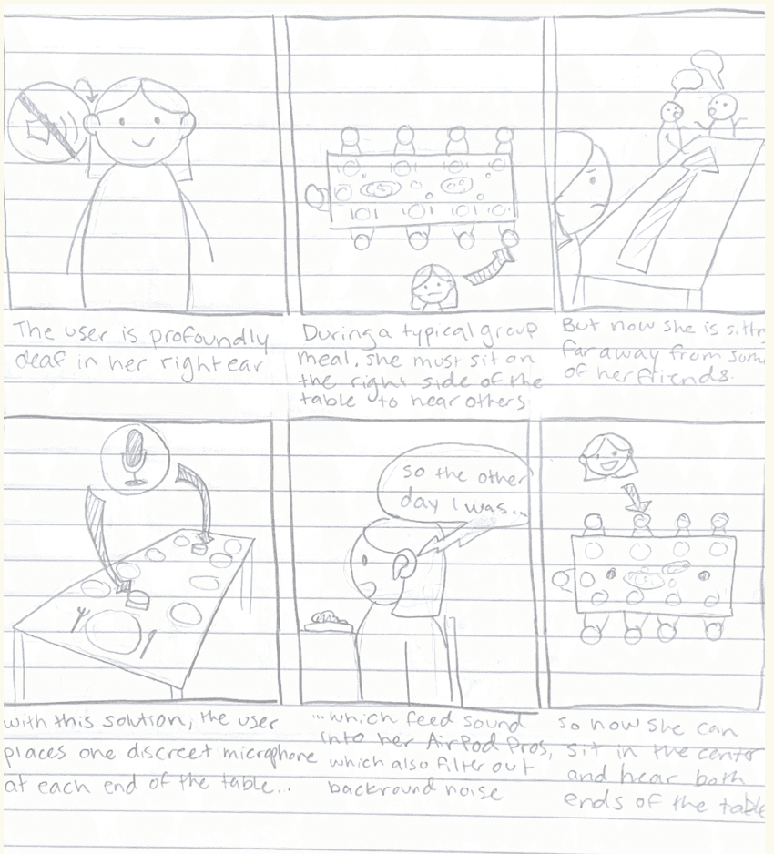
As a team, we ideated two storyboards to explore different ways assistive support could surface during shared social moments. These storyboards evolved into two distinct directions, one centered on table-based sensing, and the other on a more personal, wearable attention nudger.
click to enlarge!
Shared microphones and visual indicators embedded in the environment
This concept explores placing microphones and light-based indicators on the table to detect where speech was coming from and surface directional cues. Audio input could be routed to personal devices, while visual signals on the table helped indicate who was speaking and from which side.
This is inspired by the OWL Webcam, which is an all-in-one 360° camera, mic, and speaker for hybrid collaboration.

click to enlarge!

A discreet, personal system using devices the user already owns
This concept focuses on delivering subtle, assistive cues through personal devices like the watch, phone, and earbuds. By using haptics and lightweight visual feedback, the system nudges attention toward relevant conversational moments, such as when someone calls the user's name, without altering the environment or drawing attention.
Choosing the Attention Nudger - Why?
Our user gravitated toward the attention nudger because it felt familiar and unobtrusive, building on devices they already own. Keeping the support personal allowed it to blend naturally into social settings without calling attention to the assistance itself.
Co-Design in Action
Testing ideas through doing, not explaining.
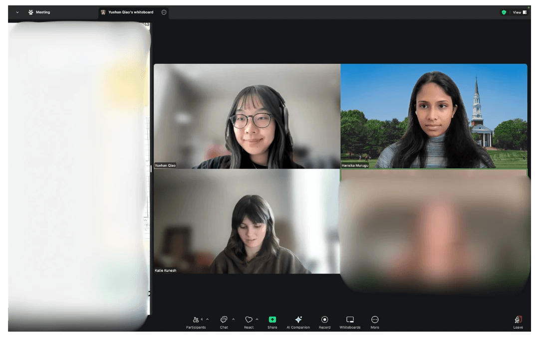
Working remotely with our user, we acted out real social scenarios, tested and compared haptic patterns, and sketched together to refine interactions in real time. Using a shared whiteboard allowed us to externalize ideas, iterate quickly, and ground decisions in the participant’s lived experience.

Understanding the basic feature requirement

Nailing down details for each feature - providing the user with potential low-fidelity mockups for better understanding
Designing Together With Our User, In Context
Exploring different ways assistive cues could show up in social settings.
As a team, we ideated two storyboards to explore different ways assistive support could surface during shared social moments. These storyboards evolved into two distinct directions, one centered on table-based sensing, and the other on a more personal, wearable attention nudger.
click to enlarge!
Shared microphones and visual indicators embedded in the environment
This concept explores placing microphones and light-based indicators on the table to detect where speech was coming from and surface directional cues. Audio input could be routed to personal devices, while visual signals on the table helped indicate who was speaking and from which side.
This is inspired by the OWL Webcam, which is an all-in-one 360° camera, mic, and speaker for hybrid collaboration.
click to enlarge!
A discreet, personal system using devices the user already owns
This concept focuses on delivering subtle, assistive cues through personal devices like the watch, phone, and earbuds. By using haptics and lightweight visual feedback, the system nudges attention toward relevant conversational moments, such as when someone calls the user's name, without altering the environment or drawing attention.
Choosing the Attention Nudger - Why?
Our user gravitated toward the attention nudger because it felt familiar and unobtrusive, building on devices they already own. Keeping the support personal allowed it to blend naturally into social settings without calling attention to the assistance itself.
Co-Design in Action
Testing ideas through doing, not explaining.
Working remotely with our user, we acted out real social scenarios, tested and compared haptic patterns, and sketched together to refine interactions in real time. Using a shared whiteboard allowed us to externalize ideas, iterate quickly, and ground decisions in the participant’s lived experience.
Understanding the basic feature requirement
Nailing down details for each feature - providing the user with potential low-fidelity mockups for better understanding
Bringing Interactions Into Form
Introducing Beam: we brought co-designed ideas into a high-fidelity system to try them out in practice.
Rather than designing a standalone interface, Beam was shaped as a system across three familiar devices:
iPhone
Coordinate the system and support setup and control
Apple Watch
Deliver subtle visual and haptic cues in the moment
AirPods
Reduce ambient noise, enhance speech, and route right-side audio to the left ear
Different conversations require different levels of attention.
To reduce cognitive load and avoid overwhelming the user, Beam differentiates conversational moments by priority and responds to each with an appropriate level of cueing.
T1
Addressed directly
When her name is detected, the system treats this as the highest priority and surfaces an immediate, noticeable cue to ensure she doesn’t miss being addressed.
Haptic
Long Vibration
T2
High-energy moments
Excited conversations with multiple speakers and laughter are surfaced more subtly, signaling heightened social activity without demanding immediate action.
Haptic
Two Quick Pulses
T3
Ongoing conversation
General conversation is treated as background context, offering light awareness cues to support a sense of presence without pulling attention away from the moment.
Haptic
Quick rapid vibration
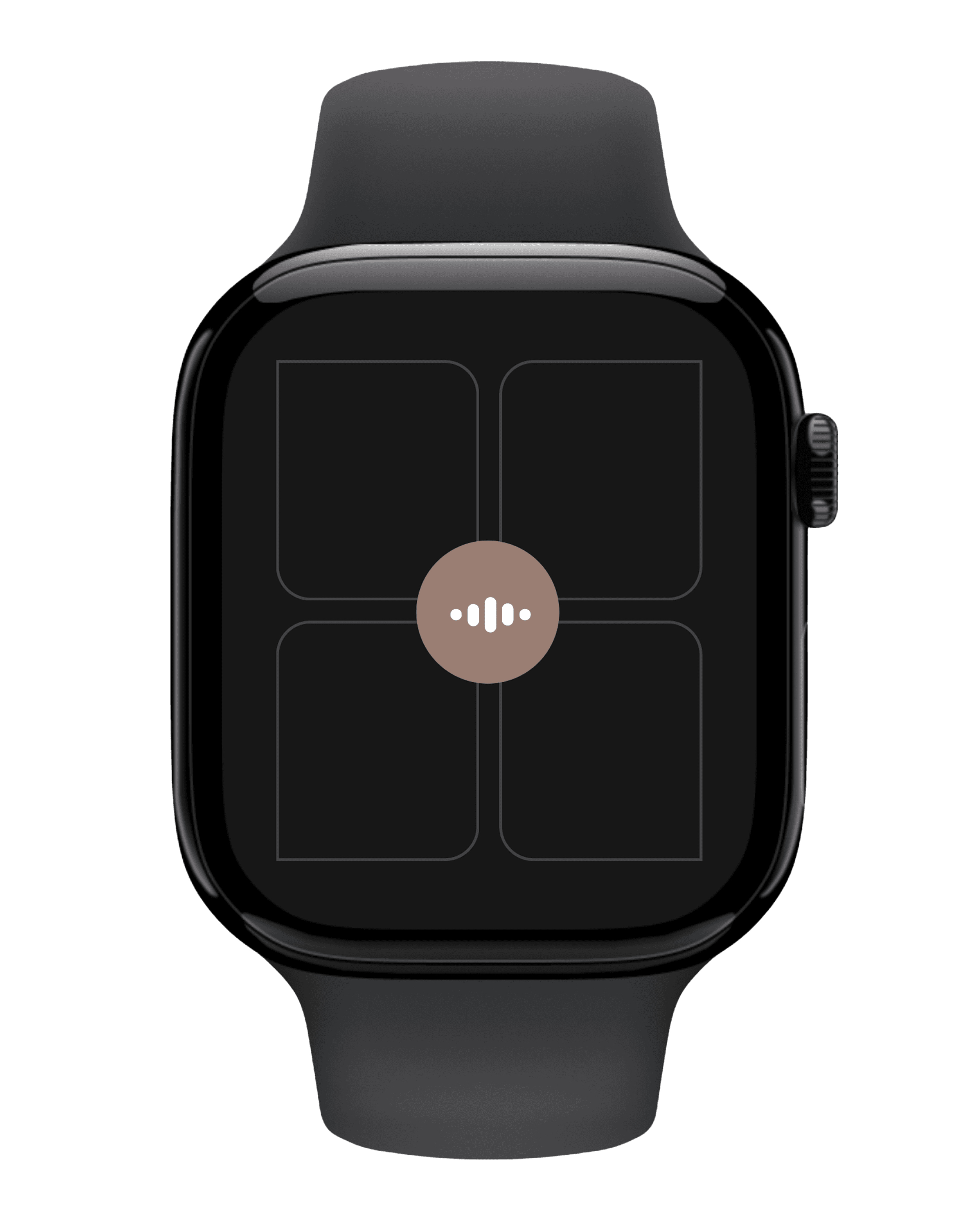
Signaling Direction Through a Quadrant-Based Watch Interface
Spatial cues should be glanceable, not deciphered.
To communicate where attention should shift, the watch screen is divided into four quadrants that map directly to the user’s physical surroundings at the table.

Conceptualising the system design!
Combining Direction + Priority
Direction alone isn’t always enough. Beam combines directional cues with conversation priority (T1, T2, T3) to adjust how noticeable the signal should be. These combinations determine both which quadrant activates and how strongly it surfaces (e.g., haptic intensity, visual emphasis).
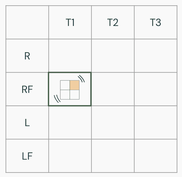
Example Scenario
Name Called from the Right-Front (T1 + RF)
Someone seated to the user right-front calls their name during a group meal.
The right-front quadrant highlights immediately.
A clear, distinct haptic cue signals high priority.
The cue is brief and unmistakable, prompting the user to shift attention quickly. This ensures they don’t miss being addressed, even in a noisy setting.
Bringing Interactions Into Form
Introducing Beam: we brought co-designed ideas into a high-fidelity system to try them out in practice.
Rather than designing a standalone interface, Beam was shaped as a system across three familiar devices:
iPhone
Coordinate the system and support setup and control
Apple Watch
Deliver subtle visual and haptic cues in the moment
AirPods
Reduce ambient noise, enhance speech, and route right-side audio to the left ear
Different conversations require different levels of attention.
To reduce cognitive load and avoid overwhelming the user, Beam differentiates conversational moments by priority and responds to each with an appropriate level of cueing.
T1
Addressed directly
When her name is detected, the system treats this as the highest priority and surfaces an immediate, noticeable cue to ensure she doesn’t miss being addressed.
Haptic
Long Vibration
T2
High-energy moments
Excited conversations with multiple speakers and laughter are surfaced more subtly, signaling heightened social activity without demanding immediate action.
Haptic
Two Quick Pulses
T3
Ongoing conversation
General conversation is treated as background context, offering light awareness cues to support a sense of presence without pulling attention away from the moment.
Haptic
Quick rapid vibration
Signaling Direction Through a Quadrant-Based Watch Interface
Spatial cues should be glanceable, not deciphered.
To communicate where attention should shift, the watch screen is divided into four quadrants that map directly to the user’s physical surroundings at the table.
Conceptualising the system design!
Combining Direction + Priority
Direction alone isn’t always enough. Beam combines directional cues with conversation priority (T1, T2, T3) to adjust how noticeable the signal should be. These combinations determine both which quadrant activates and how strongly it surfaces (e.g., haptic intensity, visual emphasis).
Example Scenario
Name Called from the Right-Front (T1 + RF)
Someone seated to the user right-front calls their name during a group meal.
The right-front quadrant highlights immediately.
A clear, distinct haptic cue signals high priority.
The cue is brief and unmistakable, prompting the user to shift attention quickly. This ensures they don’t miss being addressed, even in a noisy setting.
Testing With Our User
Testing whether Beam feels helpful, not overwhelming.
We evaluated Beam with the participant to understand whether the system supported awareness in social settings without adding distraction, discomfort, or cognitive load. Going into the evaluation, we focused on a few key questions:
Can different haptic patterns be reliably distinguished?
Do the haptic cues feel appropriate and comfortable over time?
Do visual cues support directional awareness without added cognitive effort?
Does checking the watch feel socially awkward or disruptive?
Should notifications be customizable or easily silenced?
We conducted a remote evaluation session with the participant, simulating noisy social environments and conversational dynamics. The session included haptic-only interactions as well as combined haptic and visual cues on the watch interface.
Working with our user in every step of the design process!
Task 1
Recognizing Individual Haptic Patterns
Can haptics stand on their own without visual cues?
The participant was asked to identify three distinct haptic patterns, each representing a different event type. Notifications were delivered in a random order without prior indication of which event would occur.
Task 2
Identifying Direction During Conversation
Do visual cues add clarity without burden?
We simulated a noisy restaurant environment by playing background audio while chatting. During the conversation, we sent randomized notifications to represent events occurring around the table.

What we learned from evaluating Beam
Testing with the participant helped validate core interaction decisions while revealing where clarity, flexibility, and control mattered most in real use.
Visual simplicity improves clarity
The participant found text labels confusing and unnecessary, describing them as “one more thing my brain has to process.” Through evaluation, she strongly preferred a lighter background, higher-contrast colors, and a bold indicator for the active quadrant, which made directional information less ambiguous during use.
Haptics are a reliable channel
The participant correctly identified all three haptic patterns without visual cues during testing and expressed confidence in distinguishing between them. Over repeated interactions, the patterns felt intuitive and easy to remember, indicating that haptics alone could reliably communicate event types without visual attention.
Control matters more than speed
The participant emphasized that knowing the direction of a voice mattered more than responding quickly, noting that uncertainty about direction caused social discomfort. She also expressed a strong desire to quickly silence notifications and enable event types, reinforcing the need for flexible controls in different social contexts.
Design Decisions
Working on the final design while keeping in mind the insights from our user.
Choosing high-contrast, mode-flexible colors
Evaluation revealed that softer colors and text labels created ambiguity and added cognitive effort. In response, we redesigned the interface to support both light and dark modes with higher contrast, removed unnecessary text, with a bold visual indicator for the active quadrant to make direction easier to perceive at a glance.

Allowing customization to reduce overload
While testing, the participant emphasized that knowing where a voice was coming from mattered more than speed, and that frequent notifications could become overwhelming in certain contexts. This led us to prioritize customizable settings, including the ability to quickly silence notifications or selectively enable specific event types based on social situations.
Communicating direction through spatial mapping
The evaluation confirmed that the participant could reliably interpret haptic cues and preferred minimal visual processing. As a result, we focused on communicating direction through spatial mapping, using a quadrant-based layout that mirrors the table, so directional awareness is immediate and does not require reading or interpretation.

Testing With Our User
Testing whether Beam feels helpful, not overwhelming.
We evaluated Beam with the participant to understand whether the system supported awareness in social settings without adding distraction, discomfort, or cognitive load. Going into the evaluation, we focused on a few key questions:
Can different haptic patterns be reliably distinguished?
Do the haptic cues feel appropriate and comfortable over time?
Do visual cues support directional awareness without added cognitive effort?
Does checking the watch feel socially awkward or disruptive?
Should notifications be customizable or easily silenced?
We conducted a remote evaluation session with the participant, simulating noisy social environments and conversational dynamics. The session included haptic-only interactions as well as combined haptic and visual cues on the watch interface.
Working with our user in every step of the design process!
Task 1
Recognizing Individual Haptic Patterns
Can haptics stand on their own without visual cues?
The participant was asked to identify three distinct haptic patterns, each representing a different event type. Notifications were delivered in a random order without prior indication of which event would occur.
Task 2
Identifying Direction During Conversation
Do visual cues add clarity without burden?
We simulated a noisy restaurant environment by playing background audio while chatting. During the conversation, we sent randomized notifications to represent events occurring around the table.
What we learned from evaluating Beam
Testing with the participant helped validate core interaction decisions while revealing where clarity, flexibility, and control mattered most in real use.
Visual simplicity improves clarity
The participant found text labels confusing and unnecessary, describing them as “one more thing my brain has to process.” Through evaluation, she strongly preferred a lighter background, higher-contrast colors, and a bold indicator for the active quadrant, which made directional information less ambiguous during use.
Haptics are a reliable channel
The participant correctly identified all three haptic patterns without visual cues during testing and expressed confidence in distinguishing between them. Over repeated interactions, the patterns felt intuitive and easy to remember, indicating that haptics alone could reliably communicate event types without visual attention.
Control matters more than speed
The participant emphasized that knowing the direction of a voice mattered more than responding quickly, noting that uncertainty about direction caused social discomfort. She also expressed a strong desire to quickly silence notifications and enable event types, reinforcing the need for flexible controls in different social contexts.
Design Decisions
Working on the final design while keeping in mind the insights from our user.
Choosing high-contrast, mode-flexible colors
Evaluation revealed that softer colors and text labels created ambiguity and added cognitive effort. In response, we redesigned the interface to support both light and dark modes with higher contrast, removed unnecessary text, with a bold visual indicator for the active quadrant to make direction easier to perceive at a glance.
Allowing customization to reduce overload
While testing, the participant emphasized that knowing where a voice was coming from mattered more than speed, and that frequent notifications could become overwhelming in certain contexts. This led us to prioritize customizable settings, including the ability to quickly silence notifications or selectively enable specific event types based on social situations.
Communicating direction through spatial mapping
The evaluation confirmed that the participant could reliably interpret haptic cues and preferred minimal visual processing. As a result, we focused on communicating direction through spatial mapping, using a quadrant-based layout that mirrors the table, so directional awareness is immediate and does not require reading or interpretation.
Our Final Designs
Priority-Based Watch Cues
Distinct visual states paired with differentiated haptic patterns communicate urgency and direction, allowing the user to understand what’s happening without needing to look every time.
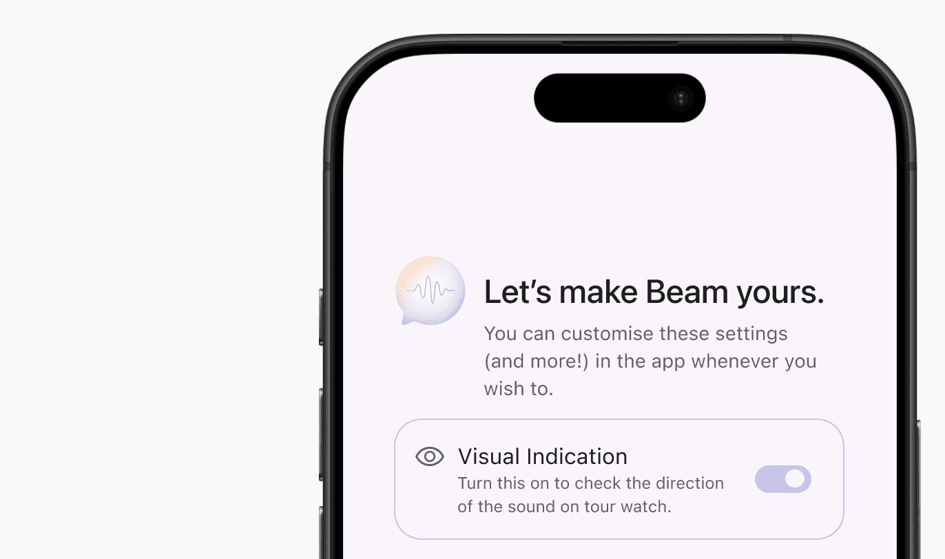
Mobile Onboarding & Setup
A guided onboarding experience on the phone helps users understand cue meanings, test haptics, and configure preferences before entering a social setting.
Dark Mode with Spatial Mapping
A customizable dark and light mode along with the quadrant-based spatial layout ensures directional awareness remains clear and intuitive in low-light environments.
Visual Toggle & Notification History
Users can turn off visuals when desired and revisit past notifications through a lightweight history, ensuring important moments aren’t missed even if a cue is silenced.
Our Final Designs
Priority-Based Watch Cues
Distinct visual states paired with differentiated haptic patterns communicate urgency and direction, allowing the user to understand what’s happening without needing to look every time.
Mobile Onboarding & Setup
A guided onboarding experience on the phone helps users understand cue meanings, test haptics, and configure preferences before entering a social setting.
Dark Mode with Spatial Mapping
A customizable dark and light mode along with the quadrant-based spatial layout ensures directional awareness remains clear and intuitive in low-light environments.
Visual Toggle & Notification History
Users can turn off visuals when desired and revisit past notifications through a lightweight history, ensuring important moments aren’t missed even if a cue is silenced.
Reflections and Learnings
Designing with, not for.
Lived experience shaped better decisions than assumptions ever could. Working closely with the participant over time reinforced the importance of designing alongside the person most impacted. Her openness and willingness to engage transformed uncertainty into enthusiasm, and her lived experience consistently challenged our initial assumptions, leading to more grounded and relevant design choices.
The value of structured participation.
Specific prompts led to more actionable insight. We found that structured activities, clear prompts, and targeted questions consistently produced richer and more actionable feedback than open-ended discussion alone. This was especially evident during evaluation, where focused questions about individual interface elements surfaced clear preferences and honest critiques.
Limitations and future exploration.
Constraints shaped what we could evaluate. Due to device limitations, we were unable to measure the speed at which notifications were interpreted. However, the participant emphasized that directional awareness mattered more than response speed, reframing what “success” looked like for this system. With more time and resources, we would further explore advanced haptic techniques (including AI detection!) to convey direction without relying on visual cues, strengthening discretion and accessibility.
Inclusive design benefits everyone.
Designing for accessibility leads to calmer, clearer interactions. Many of Beam’s design principles, reducing cognitive load, prioritizing clarity, and supporting user control, extend beyond single-sided deafness. This project reinforced how inclusive design not only addresses specific access needs, but also creates more thoughtful, flexible experiences that can benefit a much broader range of users.
design stories are better shared…
design stories are better shared…
design stories are better shared…
happy to chat, collaborate, or just say hello!
happy to chat, collaborate, or just say hello!
happy to chat, collaborate, or just say hello!